Making Steam capsule art

The Steam capsule art for Fatemender has taken multiple months, feedback from many people, and the efforts of both me and my wife. It’s probably good that I was too busy to blog about it earlier in the year as it’s changed a lot since the first version. So this blog post is about trying to summarize that journey.
Version 1
There’s a lot you want to achieve with your Steam capsule header. You want to get people’s attention, you want to be interesting enough to get people to click, and you want to communicate the important parts of your game that convey genre.
In my first attempt I was aiming for ‘tile’, ‘environments’, and ‘nebulous space’. I was imagining our landscape tiles floating in space as our main character anima looks out. I put a full weekend into it, struggling with colours, style, and perspective. But felt it was a “good enough” first take.

Getting some basic composition down.
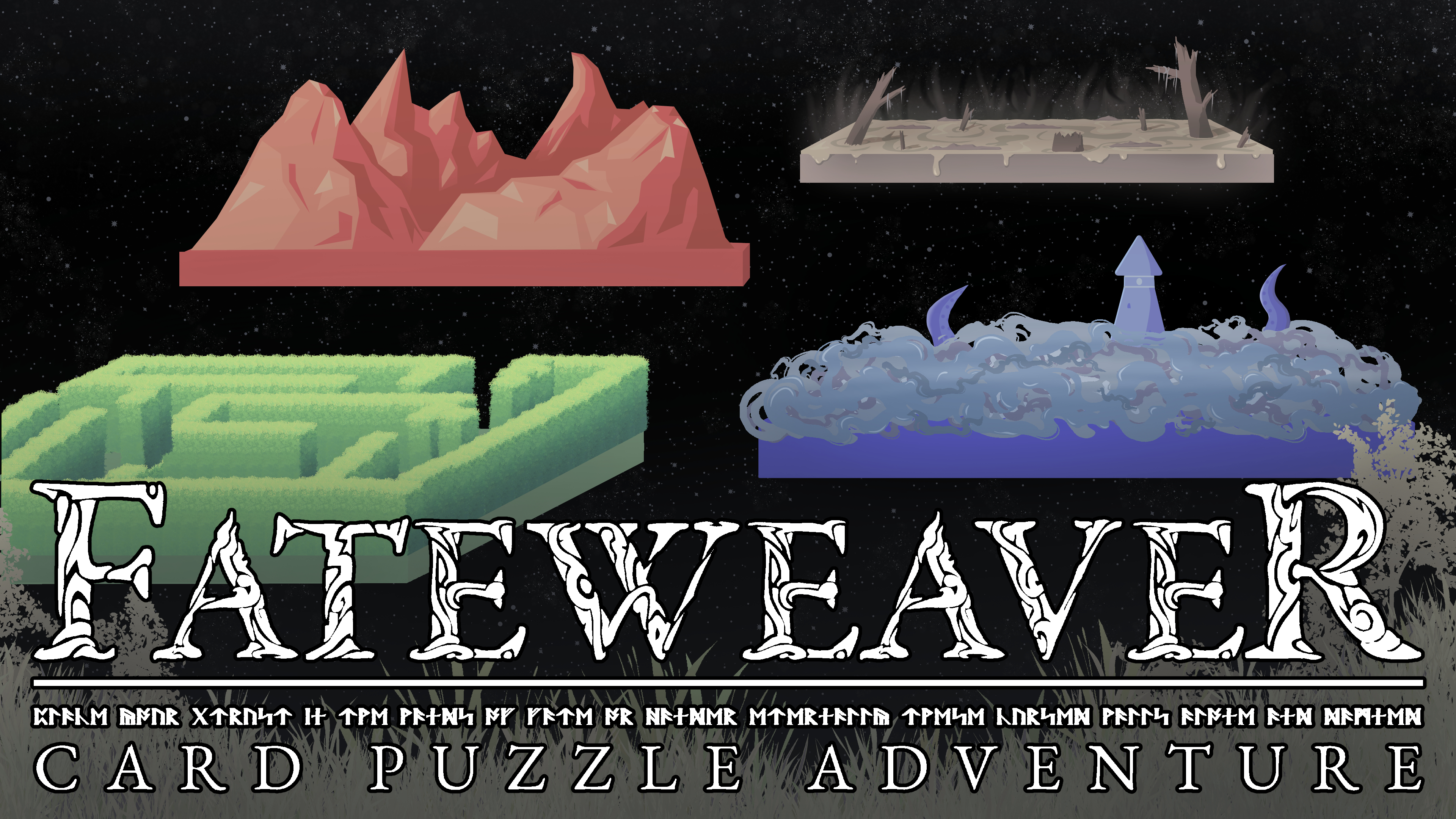
We shared it for feedback with our game group and got some feedback and suggestions on how to better convey the grid like nature of the game. It was enough of a suggestion to need a full re-do so it was on to version number two.
Version 2
I had the general composition down fairly early, working with a base grid and building on top of it. I considered having 5 tiles in view like below but ended up trying to break the balance. Instead of having 5 spread out evenly moved 4 to one side, have an “active” zone and a “quiet zone” in the piece. Creating contrast with space.
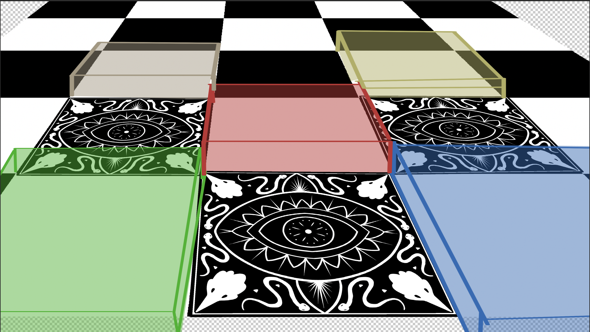
I had the goal of having more shown in each tile so there was a decent amount of sketch time going on but I was also just strongly pulling from my first version. I had bought this brush for drawing hedge-mazes because the idea of having to texture every wall was very intimidating. This brush did end up defining the style as it was a edge-less brush (no cartoon like border on it), meaning nothing else in the piece should have hard lines on the edges either.

Every few days I would choose a tile and work on it. It took many days. I don’t think there’s a piece I’ve done this year that took so much time. The file has so many layers and is at such a large resolution that it’s the first file that my computer actually struggles to open. But! It’s leagues better over v1, a clear example of getting something better the more time you’re willing to put into it. After a few weeks, we had v2.
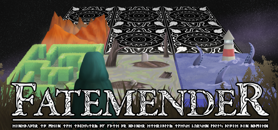
Prepping for Steam
We were getting close to publicly announcing the game so it was time to prep the Steam assets. Steam wants 6 different versions of your capsule that are all different sizes with different requirements. This process super sucks. The main image was a close ratio for the main header image so that wasn’t so bad. But then you get into the super small ones (ended up just making a new thing) and the super tall ones (hope your image crops nicely). Our very landscape shaped image didn’t play well with the dimensions for a taller image. So I went in and added a character on the other side of the board to fill space.
So after a few more hours of cropping, sizing, uploading, re-uploading, we had a Steam page and a few days later we pushed it live.
Version 3
As soon as we pushed the page live we started asking around for feedback. Our first time sharing so much of the game publicly with people we hadn’t interacted with before.
Feedback was... a lot. In that there was a lot of it and it’s not easy to always interpret feedback. I was in some pretty intense weeks at my day job during this phase and didn’t have much energy left for art on weekdays. Sophie was the one getting the feedback so she took over doing edits at this point.
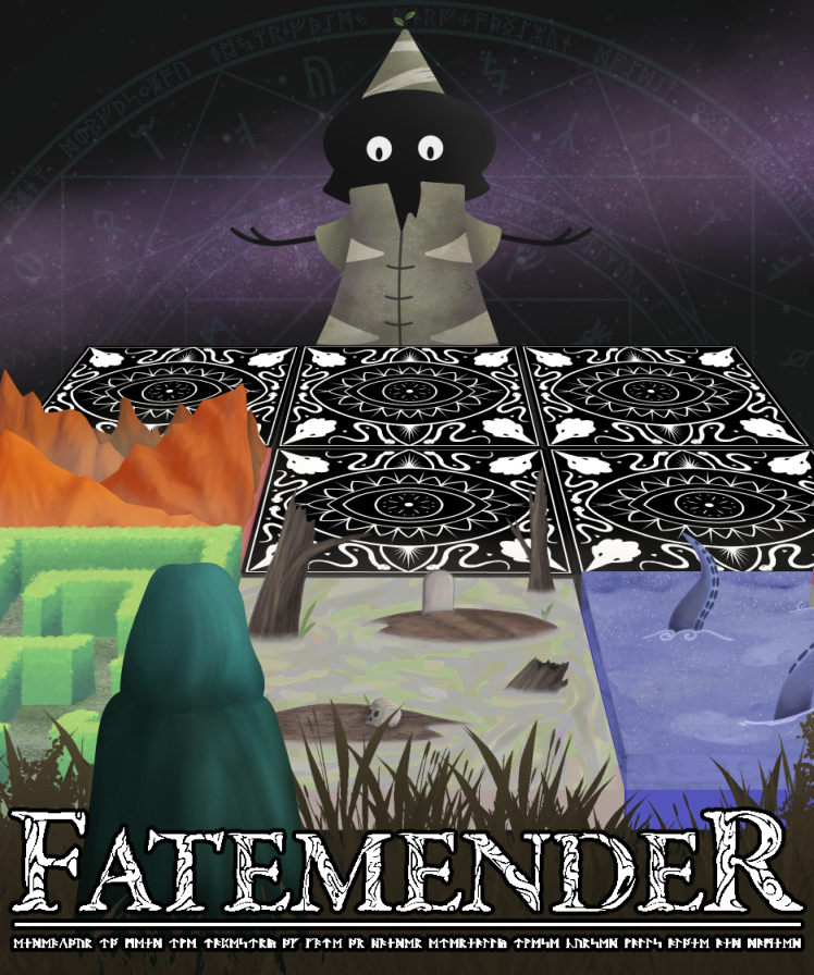
After back and fourths with a few people she ended up with a much more simplified version, centered around our character who had only been added to fill space, lol.
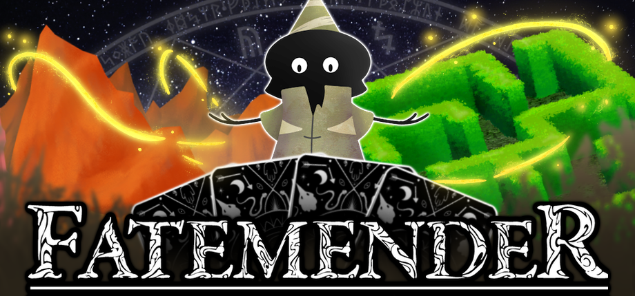
It makes sense though! There are now cards to communicate the deck-building part, still two different land types, and a focus on Blinkus, a character, which people often care about at a quick glance. It does mean that it includes only a fraction of what I spent weeks working on. But! It hasn't been for naught, as we use the full art piece in the game announcement trailer and my wife animated each grid square so that it looks sick and float-y as the last scene of the trailer:
We have already received feedback that this might be too much character focus for a game that’s more mechanics and puzzles. So we’re still kind of torn!
Conclusion
This blog post has a big take away; don’t rush your capsule art.
And also; prepare to do this more than once.
I did the Love in the Time of Spellphage capsule art in a weekend, maybe underestimated how long this one would take. We are trying to approach Fatemender in a more professional way so it makes sense that we’d need to iterate on this important part of the game. But wow the time needed to iterate on each version really piles up.
At of the time of posting this blog I’m not sure which capsule art will be live on Steam. It takes about 24 hours for an update to propagate and we’re still kind of on the fence about which one works best. We even have an idea for a fairly radical change up for a version 4...