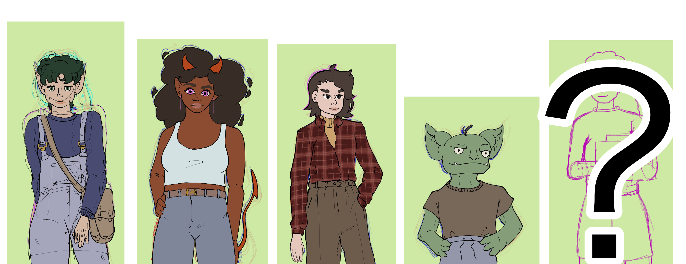
Early concept art exploration for Fateweaver
From marketing our existing games to more early concept work for our new game.
Since our existing games were done for game jams they didn’t really have much of a development cycle, you kind of jump straight into production for game jams. I remember very clearly sitting down on January 1st and getting started on character sprites for Spellphage with very little preparation. I had made Pinterest boards for a few of them, maybe did a few messy sketchy Lauren attempts, but that was it.

For Fate Weaver we’re giving ourselves way more than a month. We still want to keep development tight but we are still aiming to have a playable demo out before the end of the year. This feels like a luxurious amount of time at the moment but I know it’s going to feel like nothing soon.
This does mean that I still need to be smart about the art style we go with. For an MVP of a demo we’ll still need 20 Fate Cards, 5 Land cards, 10 items, and hopefully 2 characters. It’s still a decently large amount of assets so I want to choose a style that’s not too difficult to pull off consistently.
So I’ve been experimenting.
First draft
I did some early Pinteresting boarding to gather some classic tarot card designs and also some more modern takes from different artists. There are some really beautiful tarot re-makes out there, almost to the point of having too much reference material. So I tried to not browse for too long as it was starting to feel like an un-ending tunnel of great art.
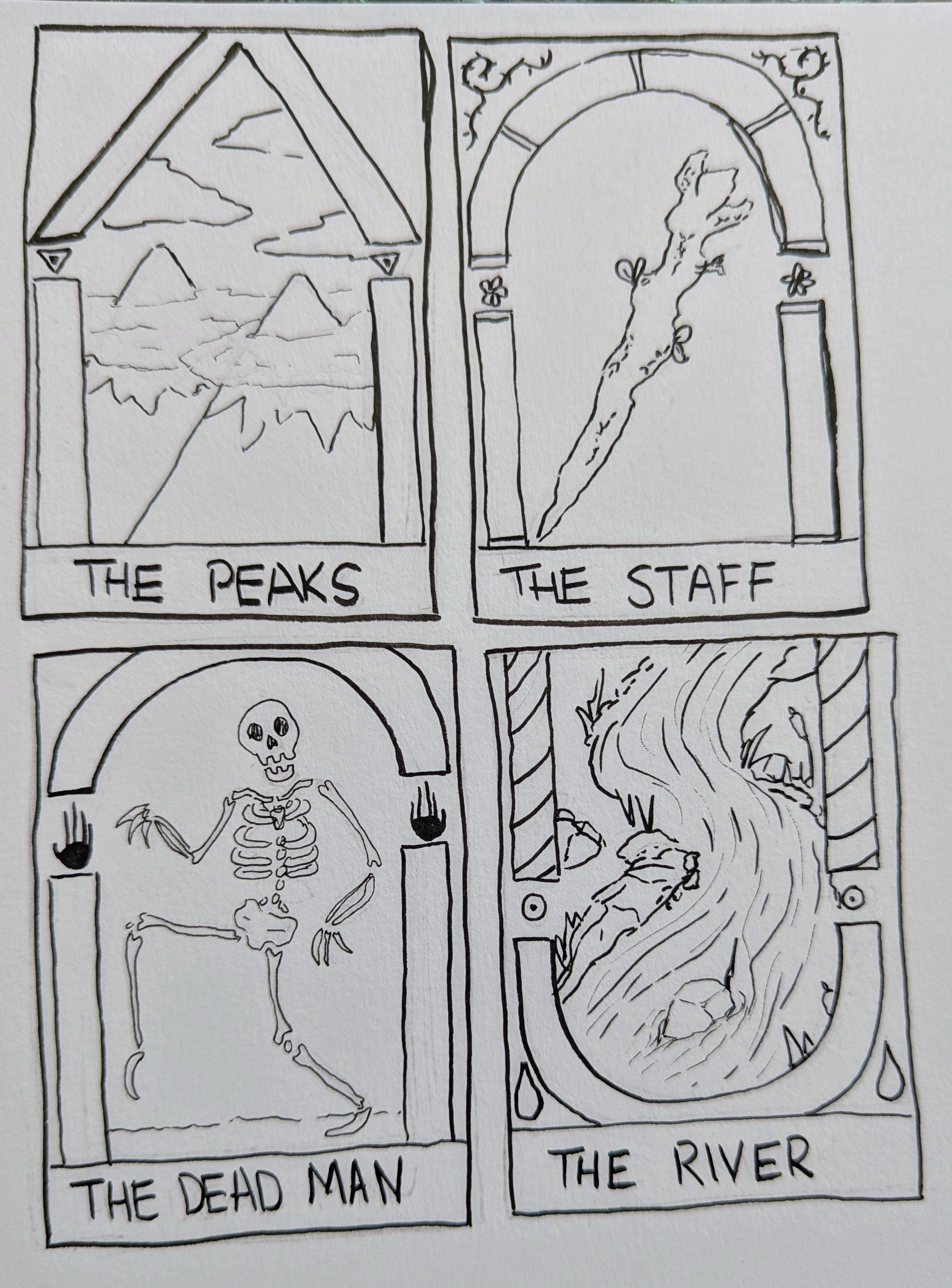
After collecting some inspiration I started to do some sketches and then some inks to try out some looks.

I ended up really liking it when there was a “frame” to the image, almost creating the look of a gate or a portal. We entertained the idea for a while because it also led to the possibility of the player going “into” the cards.
These sat for a while as we continued to develop the cards. During that time my wife mentioned having the game be all pixel art so I wanted to give that a try. So I started exploring that. Also entertained the idea of doing 1 bit, just white and black. Then she suggested a woodcut/woodblock visual. So I added that to the list.
I still wanted to try basic digital art with similar soft tones from traditional tarot card art. So I tried out all 4 ideas… twice…
Digital approaches
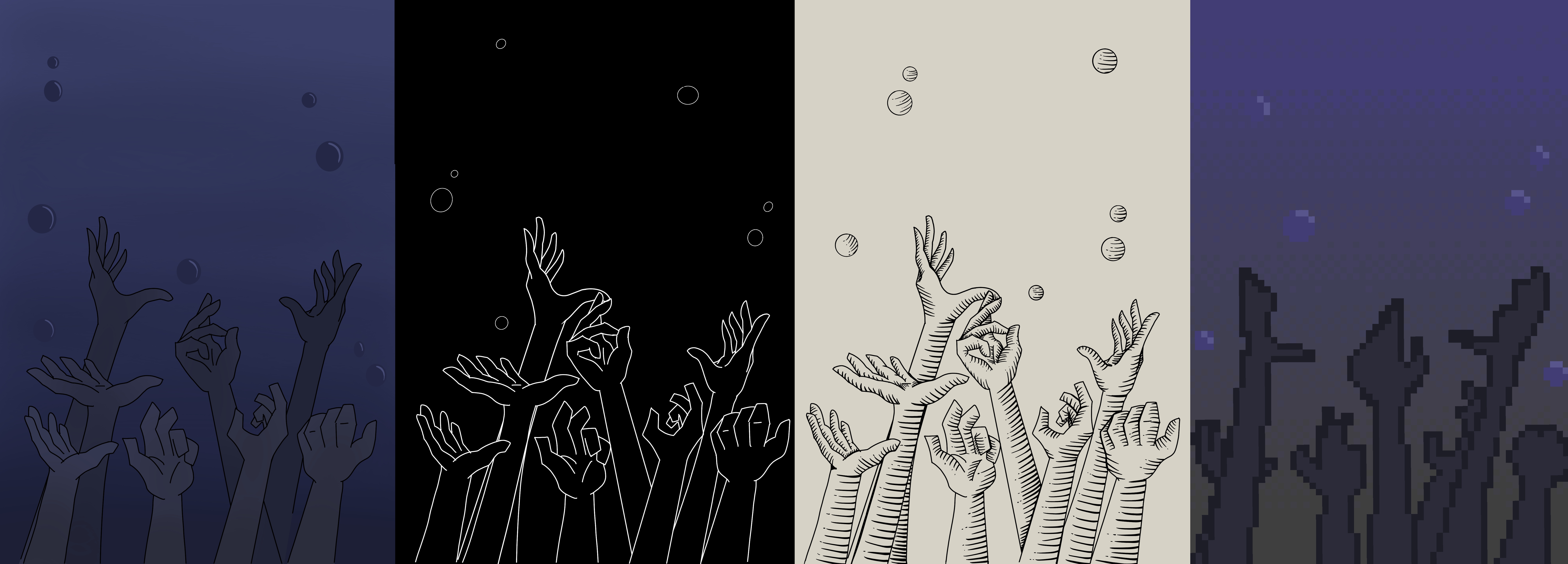
Classic flat colours, black & white, woodcut, and pixel.
I got the idea for this image for the seer card weeks ago. Before we cut the card from the deck… but I still wanted to draw it and since it was for testing styles it doesn’t feel like a waste. I just really like the idea of tears streaming down into a puddle with eyes in the puddle.
I did really like the pixel version of this one, but I did work way too small as the eyes are barely legible. I wanted to keep things small because after watching multiple videos on pixel art tips it kind of feels like “what? Are you some kind of chump that needs more than 32 by 32 pixels?”. The flats and black & white feel too plain to me, like they would need a lot of detailing to look more professional. Woodcut started to pull ahead.
So I did it again, this time for the card The Depths. A card which can stop you from leaving a Mist space.
Once again the pixel version is just too small, way too difficult to depict something as detailed as multiple hands. I do like the colour one here, even if the colours are a little muddy in this test version. The woodcut does stand out again though, but I’m not sure how I would try to portray an underwater gradient without colour. So that would be a challenge if I want to try to go that detailed.
Making a card
Woodcut style started to pull ahead. It was time to see how the style would look when trying to make a more polished version.
Having done all the tests on my iPad I did swap over to CSP and my tablet as it makes things feel more serious. And I wanted to try out a few brushes I thought could make the woodcut style faster and more decorative. I chose a card with an idea design, The Tempest, and experimented a bit.
When I started working on things I was worried that my lines were way too big. Seeing it online after it became clear that these brushes were much too small and instead they just look kind of blurry so I think I’ll do another pass but with the brush size cranked up.
Once I finished this Tempest attempt I wanted to see if I could animate a card in Godot because it would be really fun to do some drip marketing with animated card reveals. I hadn’t touched any of the 3D stuff in Godot before but I thought it’s gotta be easy to just spin a 3D object around an axis.
I created a Node3D, gave it a Sprite, then gave it a second Sprite. One sprite for the front of the card and one for the back. This is probably, absolutely, not the best way to do this. I had to resize the back of the card because it was made weeks ago at a ratio I don’t remember. Then I created an animation to spin the parent node and recorded it with OBS.
Conclusion
All art is still very experimental right now, nothing is in its final form. We’re still searching for the style that we think will fit the vibe and the story of the game best. Since we have the time it’s been nice to be able to not just have to take the first idea you have and run with it.
Ideally we can have at least decently presentable, if not final, assets for our first playable. One of our previous collaborators as mentioned his interest to make another game with us so we may even be able to tackle this with 2 artists which would be a nice multiplier for a game 🤔
I expect to make more art iteration posts before launch! But for the next few weeks I want to spend time learning and testing out 2D effects in Godot to see what kind of visuals we can add to cards. So another use for my early card prototypes.


