
Course summary: Kandaem's Method
Notice! If you have received this blog post in your RSS app of choice it means I succeeded at forwarding my old RSS to my new blog. If you didn't get it I messed up and you might need to re-subscribe...
Over the winter break I let myself indulge in an art course. I had been doing art exclusively for Fatemender for a few months at that point and while I felt like I saw some solid improvements in my output for the Fate Card characters I still felt some gaps.
One such gap was hair. You may have noticed that one 1 of the 3 Fate Card characters has hair...
So while I was being bombarded with art course discounts over the Black Friday weekend, the one that stood out most to me was from Kanda because of the beautiful way she draws hair. I too want characters with beautiful hair. So I bought the Creating and Illustrating Characters: Kandaem's Method course.
The basics
Like most drawing classes Kanda begins with some general basics focused on an intro to important Procreate features and brush selection. I often dread this part of courses because I don't need an intro to programs but Kanda did highlight a few things I hadn't known. Such as the fact that you can use liquify on a selection and not just a whole layer. Good tip! She also focused only on the main tools she uses in her workflow instead of trying to explain the whole program.
She then gets into breaking down human bodies with some time spent on anatomy. Similar to how she covered Procreate features she spends time highlighting the main parts of anatomy that matter to her art style. She repeats many times that she's a Vibe Artist more than someone who is concerned with getting anatomy 100% right. It's really interesting to follow the course of someone with a very distinctive style and who knows how to explain those style decisions.
It's pretty clear looking at Kanda's collection of work that she likes hard, triangular shapes. And her explanation for that is basically just "I like it" which is something you love to hear. An artist following the pull of what they like because they can. There was a similar approach to shapes in the character artwork in Hades 1, where more triangular shapes were favoured over curves.
Character features
Part of the course also spends time on how different features can convey personality or story about a character. Some of this is more obvious stuff like clothing, while other things come from a cartooning history like "big round character = friendly" or "sharp features = villain coded".
Features like chin or nose shape are often things that just leave my mind when I draw a face. I'm so happy to just get a shape down that doesn't look bad that I don't often try to execute a specific shape. It's something I want to work on expanding my mental image library of. Should just be drawing way more faces.
Preparing my piece
We had a new D&D campaign spinning up at the end of December so I wanted a piece of my character to use when we played. But I had a problem, I had no idea how she looked yet.
So to Pinterest I went. Except a "new" Pinterest account because I got logged out of my old one which is tied to a dead email and I really don't care enough about Pinterest to try to get it back.
I had a few pieces of the character, I wanted a scythe wielding warlock tiefling. So I went a lot of time looking for scythe reference poses, then doing a bunch of pose studies. Then I needed a colour scheme so I chose some premade ones, did some mini paint blobs in a character shape and put it to a vote to my D&D group.
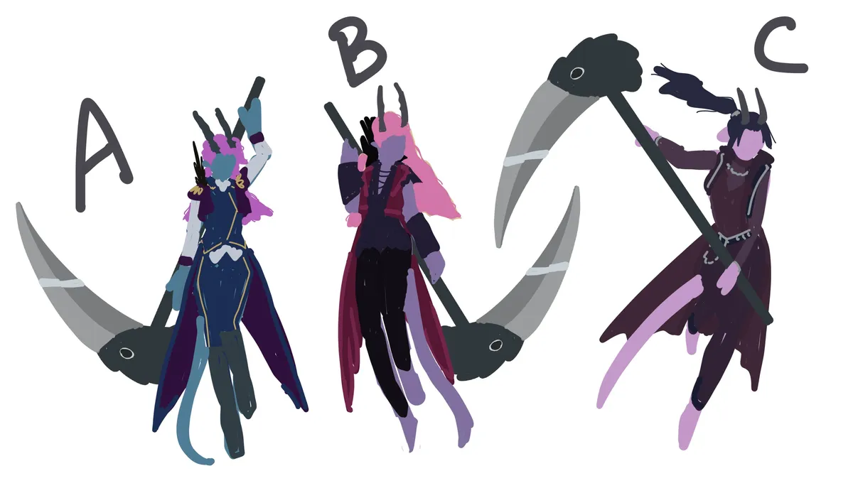
A big problem was that I had no idea how I wanted the character to dress so I also did a bunch of outfit ideas on a base.
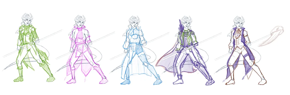
I've been trying to really focus on good workflow habits so I spent a lot of time on my base pose / sketches. There were some really interesting and dynamic pose references available but I want something that would work well to show off the scythe and outfit. So this just resulted in multiple Procreate files.
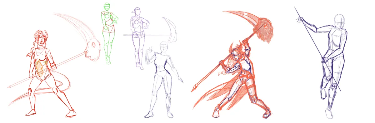
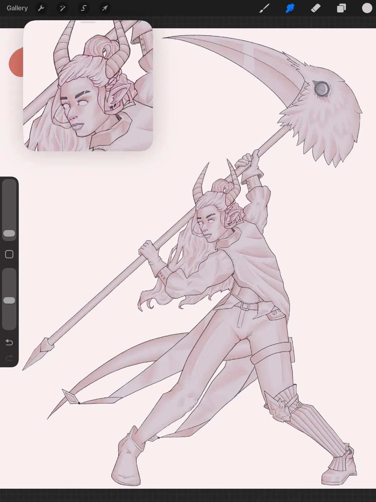
I eventually got to one I still liked and refined it a little more to take it to official "lose sketch" to a more "solid sketch" to finally reach the more iconic parts of the Kanda method.
Rendering in the Kanda Method
So Kanda does a shadows/shapes first kind of rendering approach. This means giving yourself a base flat colour for your character and then adding the shadows that help design a shape in a soft pink. I really wasn't expecting this to work on my first try and it takes a decent amount of being able to visual 3D shapes in your head and I was afraid to have to execute that. I ended up loving both the process and the look. Even though I think it took me almost 2 hours.
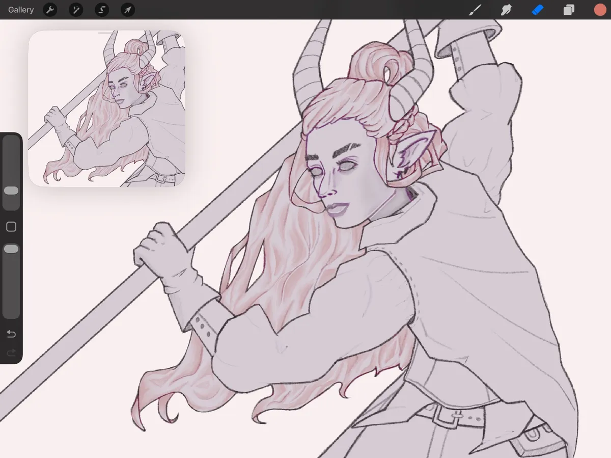
I started with the face and hair as it was how Kanda started in her piece. I was also just really excited to work on the hair since it was a big focus of my practice. I figured out within minutes that I was working way too small and resized my line work. This made my line work fuzzy but I didn't want to re-do it so I just carried on. Redoing or cleaning up line work areas as I went. Which is actually probably why this stage took so long.
There are a few more shading passes after this. I always forget the names for the shadows, there are too many. But basically the first pass was to make shapes and not really think about directional light. But now we're doing shadow passes where it is more about what parts of the shapes get less light and can be made darker. Once all the shading phases are done you can add base colours.
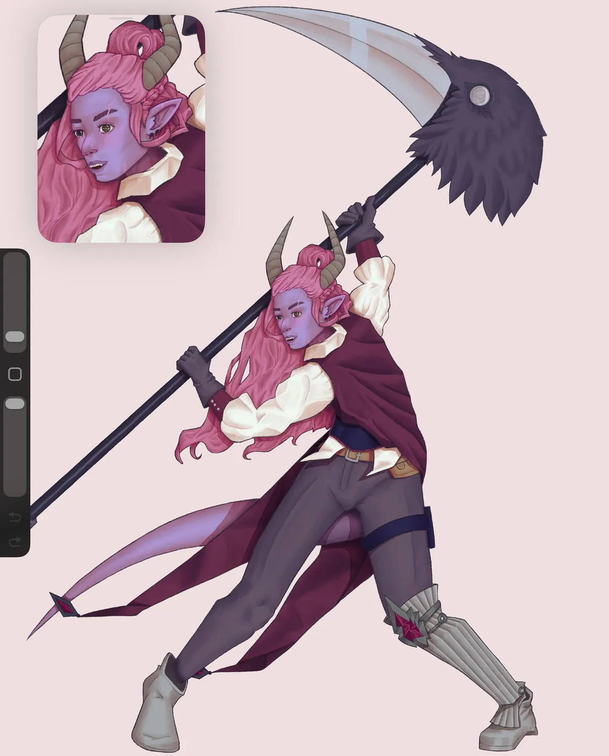
This is usually what we'd call "putting in flats" but because the shadows are there already nothing really looks flat so the name feels wrong. But it was really cool to see colours come alive with shapes so instantly by just doing a colour drop. After colours was a lot of cleanup, finding little holes and gross looking lines to fix. The shadows got recoloured because I was working with some dark colours that made them disappear. Added highlights and more strands to the hair and spent a hair bit of time re-working the shapes in the jacket. There are a few more phases after this still, and a lot of like "final touches" to achieve the final look. I rarely work with so many filters or background things so I gave myself a whole half day to just play around with background shapes and colours.
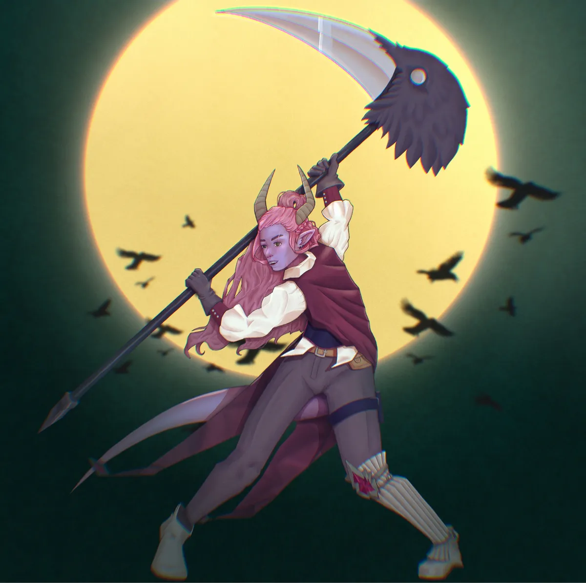
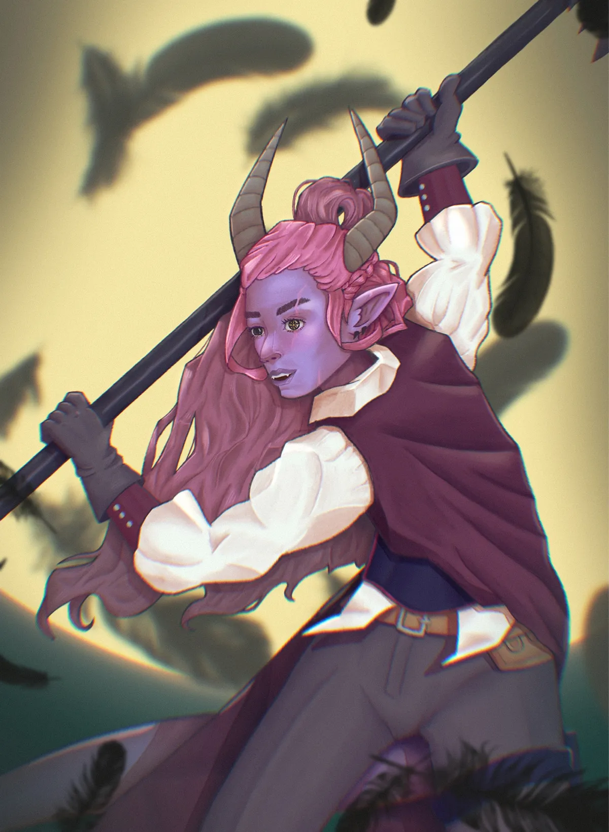
Because a lot of the final touches involve blurring or fading out certain areas I made 2 final versions, one which is a face crop as the piece is very large due to the scythe but I've very happy with how her face turned out and wanted to make it more visible.
This whole project covered 3-4 weeks but with me not actually starting the main piece until the last week. Where I then did basically 3 fully time days on it between watching the lesson and then executing the steps. It felt really nice to have a project to work no everyday and to see it take shape very clearly every hour as all the pieces came together. Just a really nice way to finish off a year where I felt like I was making big art strides but only had Fatemender work to show for it.
Conclusion
After working away on one piece for 4 days I did just hop into another one of the same character. I felt like I had learned a lot and I wanted to go through the workflow again with my better grasp of it. However I ended up rushing it and messing up early so I need to go back to the loose sketching phase on that piece lol.
I've also been picking away at smaller but important pieces for Fatemender. Lots of little UI icons to replace the assets we had been using so far. Getting close to the end of the list of everything needed for our demo.
The real time sink has been migrating this blog to BearBlog in hopes of giving myself a smoother posting experience. I'll likely be playing around with the theme and design for the next few months but I feel like it's in a clean and readable state.